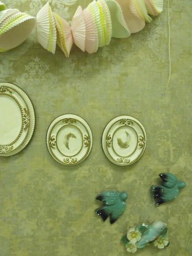
I'm sort of thinking about making this image the postcard from my show but I'm also wondering if I should use a piece of my artwork. I don't know what to do and I need to do it soon soon soon. What do you think?
Also! Last time to mention my giveaway! Go sign up for a chance to win a framed drawing of a little ghost. Maria-Therese says he looks confused. Probably wondering why I keep talking about him. Monday I will draw the name for a winner! Thanks for all the music!
Have a great weekend. Hopefully it will be sunny where you live.

10 comments:
I love this photo and think it would be great as your card. I know where you're coming from wanting it to be a piece of your work, but maybe this encompasses the feel of the show? I'm biased though, I always like snippets of information :)
Yes! I like this one as postcard for your show, I think this is stronger as an image than a single artpiece because it reflects the total atmosphere (what do I know about it, right ;)but I've been following your blog for a while now, so I think I have a bit of an idea:))
(Very rainy at the moment :( )
Happy Weekend!
ha at the same as Rachael, and we are also more or less saying the same thing :)
take a photo similar to the one you have but sneak one of your smaller pieces into it. then put the title on the back.
i really like the image. especially the top half. the light and the cupcakes wrappers contrasting the wallpaper. excellent. i might try a few other shots with the bottom information in some other configurations. don't use any actual art, this is far more intriguing and leaves the viewer with a sense of wonder.
I love this like all the above! It leaves me wanting to know more.. to come see the work in person!
I think the photo works. It reflects the tone of your art very well. Good luck with the show.
I do really enjoy this image, my only worry for a post card is that it's vertical, and post cards tend to be viewed horizontally. A nit-picky thing, but just thought I'd mention it ;)
I like it but I agree, you have two good options!
And yes, I thought the ghost looked confused & as if it's scratching its head :D
Like :-S ?!
I think the birds is a good image that sets the tone for what your show will be. You could always print a small color image on the back of the postcard of one of the actual prints. Also, listen to jonsi (I'll bring you the album at the end of the month)
Post a Comment